
In this assignment, I’ll be analyzing the use of contrast, repetition, alignment, proximity, and color in a recent ad published by Dove.
Credits:
Advertising School: S.I. Newhouse School of Public Communications
Art Director student: Yuri Suh
Professor: Mel White
Find the original here
Analysis
Contrast
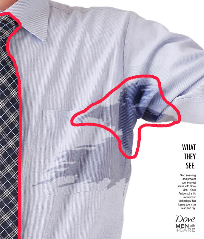
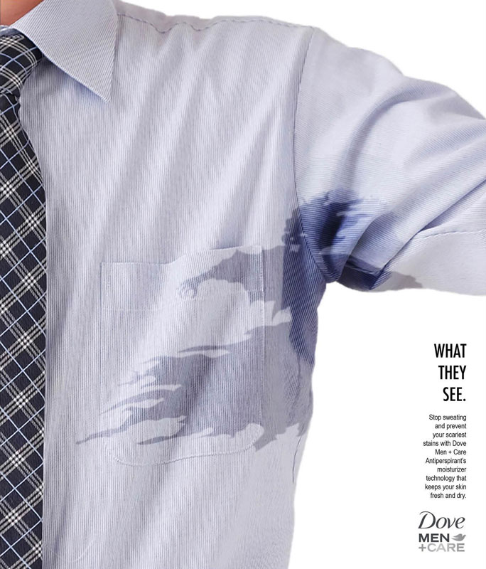
The contrast in the advertisement is found between the light blue of the shirt and the dark colors of the tie, sweat stain, and text. The darker shades and irregular shape of the sweaty ‘ghost’ in the armpit draws your eyes right at the start and you know almost immediately what the ad is about. The dark contrasting shade of the tie draws a solid line that establishes the position of the picture. The generous white space contrasts the black text and gives the eyes an easy place to go to discover the purpose of the ad.
Repetition
The principle of repetition is found here in the patterns of the tie and the repeating text styles. Again, the solid repeating pattern of the tie gives the ad a solid foundation that allows the consumer to evaluate the image from. The font used for ‘What They See’ is a repetition of the font in the logo ‘Men + Care’, just stretched taller.
Alignment
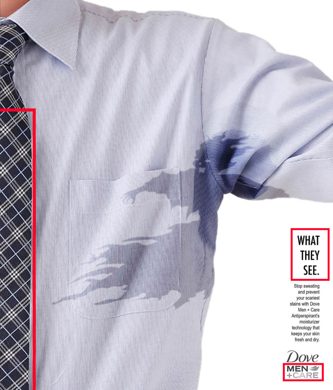
The alignment in the ad is found mostly in the text. All text is right-aligned, forming a solid line down the side of the ad. The text is also equidistant from the sides and bottom of the image, and the blocks of information are equally spaced. One other use of alignment is how the tie aligns the shirt squarely with the image so the viewer knows they are seeing one half of the shirt.
Proximity
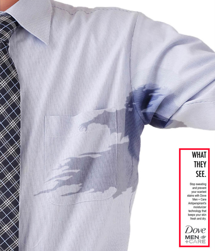
The proximity in the ad is well handled—the viewers eyes are drawn first to the sweaty ‘pit monster’, then to the heading below and to the right that reads “What They See”. The relevant information is in smaller text grouped with the heading, so that the consumer can stop and read if so inclined. However, for those who don’t stop to read, the well-known Dove logo is grouped with the text just below so that those who don’t stop to read still take note of the company branding.
Color
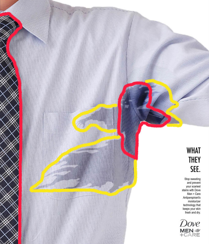
The ad uses a monochromatic-style color scheme with varying shades and hues of blue. The darkest shades of the ‘pit monster’ correlate with the shades in the tie (highlighted in red) and the lighter hues of blue (highlighted in yellow) also match. The Dove logo has just a touch of color to bring it forward in the viewers’ eye, with the ‘Dove’ and ‘Men’ matching with the darker shades of the tie and stain, while the ‘+Care’ and Dove icon are a lighter hue of grey. The overall color is quite pleasing.
Conclusion
The Dove ‘Monster’ advertisement demonstrates a proper application of all five design principles: contrast in tones, repetition in text and visual patterns, alignment with the edge of the page and other elements, proximity grouping of related information, and pleasing color choices. The consumer is drawn to the unique and contrasted ‘pit monster’, then presented with relevant information about the Dove products being advertised. Alignment and proximity make the information easy to process. All-in-all, a wonderful ad that leaves me just ‘spooked’ enough to consider their product.