
Hey! Thanks for tuning in. Today we’re going to go over what makes a creative ad professional and create our own version of a humorous Snickers advertisement. We’ll discuss how design choices, color, and typography make their design appealing, and copy those same elements into our own version. Let’s get started!
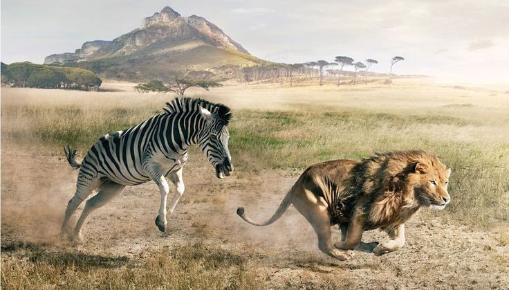
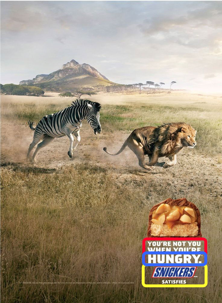
The advertisement we’ll be looking at comes from the ‘You’re Not You When You’re Hungry’ campaign run by Snickers in 2014. It comedically presents a zebra chasing a lion in a strange reversal of predator/prey roles, with a caption that says: “You’re not you when you’re hungry.”
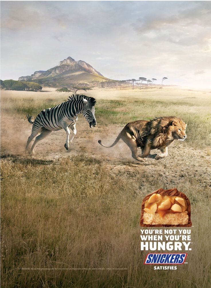
Published in Lüerzer’s Archive, Vol 2. 2014
What makes this advertisement so effective? The creators knew how to utilize design principles (contrast, repetition, alignment, and proximity) in their favor, including color and typography. What did they do? Let’s highlight it in the next couple of images.
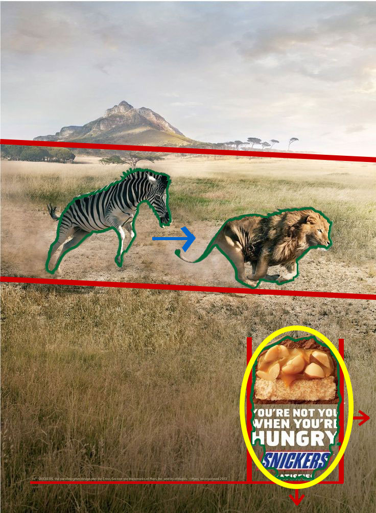
As you can see, there is a LOT going on in this photo. Let me break it down. First off, the green lines represent areas of high contrast in the photo. The creators deliberately made the background of the photo with the mountain and the dry grass of the Sahara landscape very low contrast and flat so the readers eyes aren’t distracted by the image. Instead, the contrast in the image comes in the subjects, in what they want your eye drawn to. The zebra, the lion, and the snickers bar and logo below are the things that pop out from the contrast.
The red lines indicate the use of alignment, or positioning items relative to each other or the edges to create uniformity and structure. The text, logo, and snickers bar are all aligned evenly, equidistant from the edges. the small attribution text is even aligned with the bottom of it. This type of alignment is centered and easy to see. A less obvious alignment is the alignment of the horizon with the line of travel for the lion and zebra. The lines I’ve drawn indicate how the designers took advantage of aligning that direction of motion.
The blue arrow indicates repetition. There isn’t a ton of repetition in this specific ad, though there are some elements in the text and color we’ll get to later. In the picture itself the greatest repetition is simply the running shape and motion of the two animals. The last highlight, yellow, indicates proximity, where things have been grouped together to show a relationship. When your eyes stop there, it’s obvious that the heading has something to do with Snickers and their desire to advertise as it is all tightly grouped together.
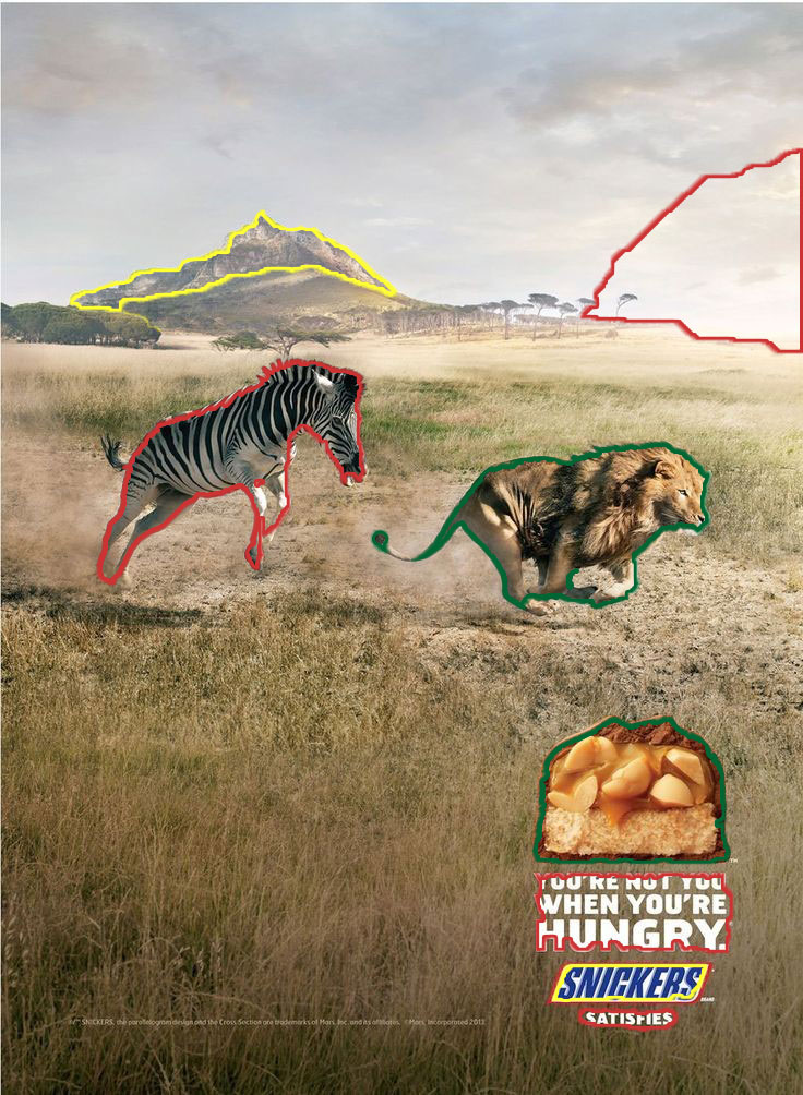
This draw over shows some of the similar color elements in the advertisement. The red highlights outline whites, from the whites of the zebra to the whites of the sky to the bold white text of the headings. A similar color comparison is found with the lion and the gold and brown colors of the snickers bar outlined in green. Even the blue of the Snickers logo outlined in yellow has a color doppelganger in the deep purple blues of the mountains in the background. The bolder tones of the golds and browns in the photo have wonderful color chemistry with the lighter hues of blue found in the sky and mountains. The color choice gives a lot of options all within a pleasing scheme.
The typography in the ad is simple and well-chosen. The red and blue highlight boxes are the same font, a stylized and rounded font with pointy edges. The font slowly increases in size and the last line, ‘HUNGRY’, is extra bold and has great contrast. The lower font in the yellow box is a Sans-serif font that is quite similar to both the Snickers logo font above (just not italicized) and also quite similar to the first font above, though not quite as stylized. The fonts are all white, except the Snickers logo, which carries the brand recognizability with the bold blue letters and red outline.
Now that we’ve seen how the professional ad utilized these design principles, let’s make a version of our own. Feel free to try it out yourself!
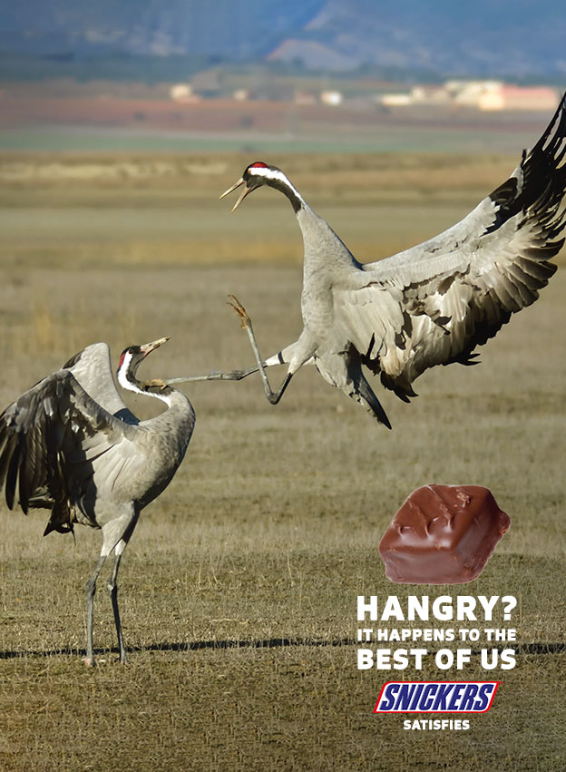
Here’s our attempt! Obviously not quite as professional as the previous example, but hey, we made it completely from free stock image and in only a few hours without a professional creative team. And, it still looks pretty decent! So let’s talk about why these ads match up, why our example could fit in the same ad campaign.
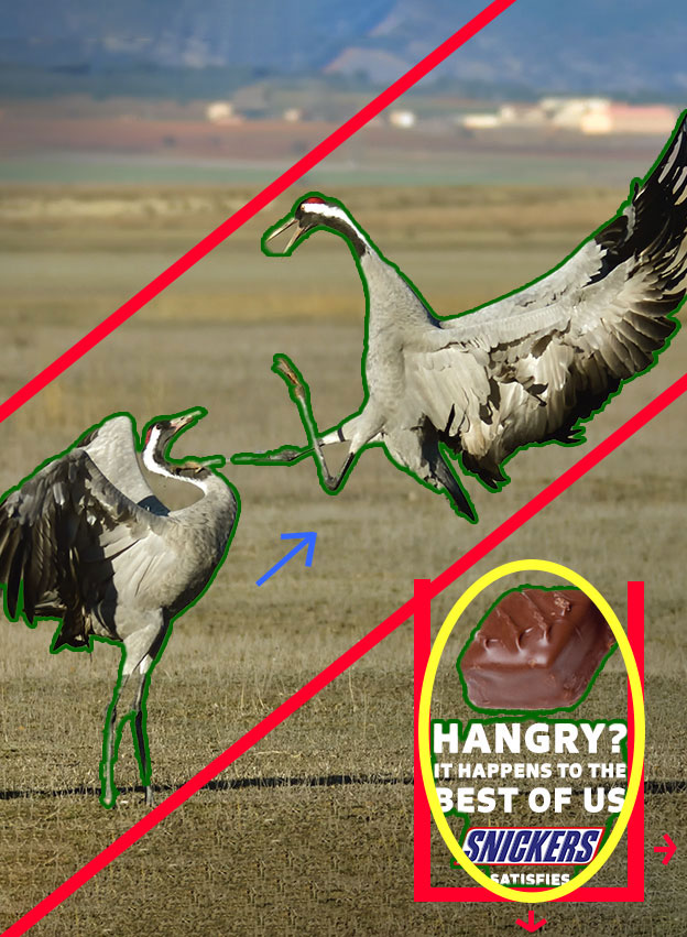
You might notice that these are all of the same draw overs we had on the previous ad, and you’d be right! The alignment is nearly identical in the location of text equidistant from the edge of the ad. The alignment of the direction of action with the birds is slightly different, but we no longer have the horizon line in the background to line it up with, and the direction of motion actually lines up with the blue line in the mountains you’ll see just above the red line on the top.
The green outline highlights the high contrast subjects, specifically the birds and the text. The blue line shows the repetition this time not just of similar forms but actually the same animal, and the yellow circle indicates the proximity of the grouped headline and branding materials.
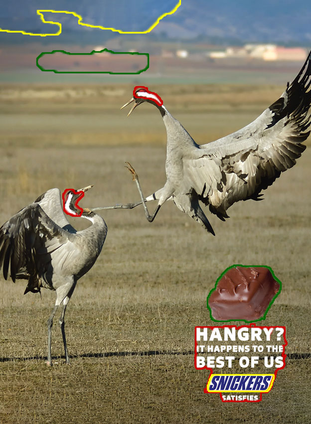
Here again, I’ve highlighted some of the similar color elements. The birds have white and red on their heads, a matching tone to the red and white of the Snickers logo (excuse the yellow highlight to match it to another part of the image). The browns of the Snickers bar highlighted in green are found in the mountain background, as are the blues of the Snickers logo highlighted in yellow. The background of the desert grass has a similar tone to the yellow grass in the Sahara ad previously, though not quite as golden, and the blacks and silver greys of the birds stand out crisply against the rest of the image.
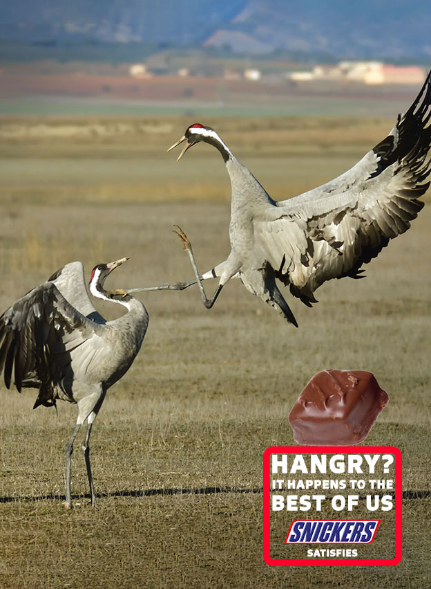
The typography in this version is slightly more simple than the previous version, mostly because of the difficulty of mimicking a stylized font or finding a suitable replacement. The closest thing I could find was this Sans-serif font, which doesn’t look quite as styled in the text on the top, but is the same as the text for ‘SATISFIES’ underneath the logo. The contrast comes in the varying weight of the text from bold to lighter and the size, as well as the contrast between the heading and the italicized or slanted text of the Snickers logo.
In the end, I think we were able to make an ad similar enough in both concept and design that it would fit in the same ad campaign as the original zebra-lion ad. The concept of having animals fighting to demonstrate that Snickers can solve harsh feelings is analogous, as is the setting and the general layout of the advertisement. With a matching color scheme, corresponding directions of motion, and parallel text content, our advertisement meets more than enough qualifications to be a good look-alike. Were this an actual professional job, we’d have access to more high-end materials, the stylized font from Snickers‘ previous ad, and probably more leeway with the design including moving around the elements within the ad layout. However, I think we’ve learned quite a bit from re-creating this ad, I know I sure have.
Thanks for tuning in to my blog, and good luck designing!