
Welcome to the blog! Today, I’ll be analyzing typography styles and basic photography tips that can help you create a visually pleasing magazine spread. We’re going to identify the different font types and photography rules used in this spread, an excerpt from For The Strength Of Youth, a publication by The Church of Jesus Christ of Latter-day Saints. You can find the original source here. After talking about the use of font and photo styling rules, we’re going to mimic the photo included on the second page by taking a few of our own!
Typography
Let’s talk about fonts. There are thousands of fonts available, most free to the general public. So, which ones do you use? The important thing is to contrast your fonts. Using one font creates a pretty basic look, but using two fonts that are too similar can cause visual clash because the viewer can’t distinguish them but knows they’re not the same. When picking fonts a good rule is to to use fonts of different types entirely.
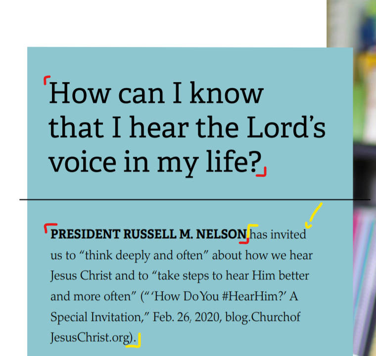
In this snip from the corner of the second page, you can see the fonts a little better. The font outlined in red is a slab serif font because of the horizontal, blocky ‘serifs’ or embellishments on the corners of the letters. Look at the first ‘H’ next to the red bracket and see the jutting edges. You also know it is slab serif because there is little or no thick/thin transition in the characters. The second font is an oldstyle font because of the angled ‘serifs’ on the corners (look at the top of the ‘d’ the small, yellow arrow points to), and because of the slight thick/thin transition. Oldstyle fonts are typically preferred for large amounts of content text, so it’s no surprise to see one here.
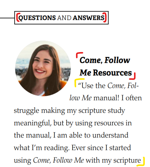
This screenshot from the top left of page one helps us see how the typefonts contrast. The slab serif font is bold and thick, giving it a deeper pull to emphasize headlines. This is called weight. Of course, some headlines or text are larger than others. This is called size. As we identified earlier, the serifs on the fonts are different, one thick and blocky, the other angled and light. This is called structure. The spread also makes use of italics to attribute quotes, to reference content (like the Come, Follow Me in the image above), and to emphasize the quote in the bottom right of page one. Using italics is one way to create contrast with form. Even among the slab serif headlines, some are different than others, like the ‘President Russell M. Nelson’ compared to the ‘How can I’ question posed in the previous image. The ‘President Russell M. Nelson’ headline is all caps (another way to adjust form) and has tighter letterspacing so that it appears to have more color than the heading above, although they are technically the same width. By using two contrasting fonts and implementing principles of size, weight, structure, form, and color the author has organized the spread neatly and created a visually appealing design.
Photography
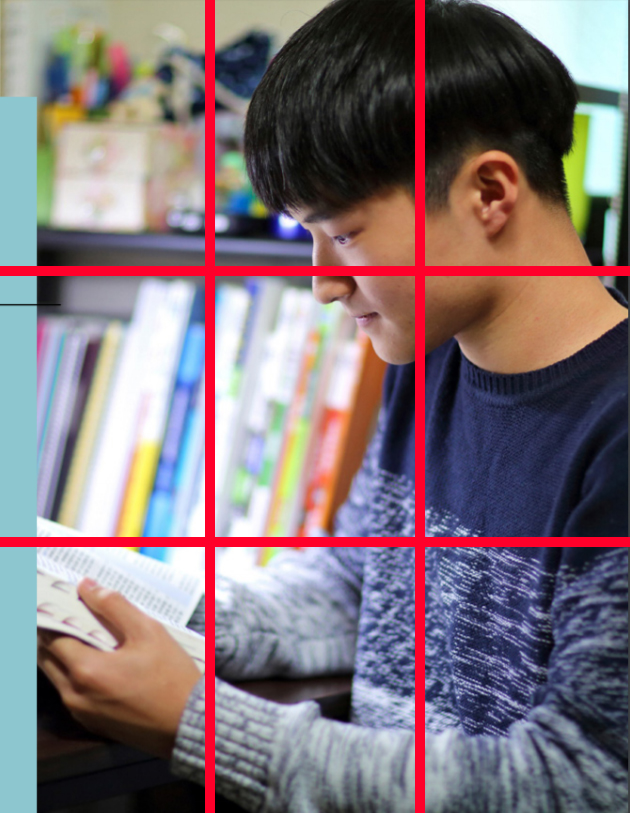
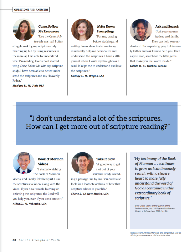
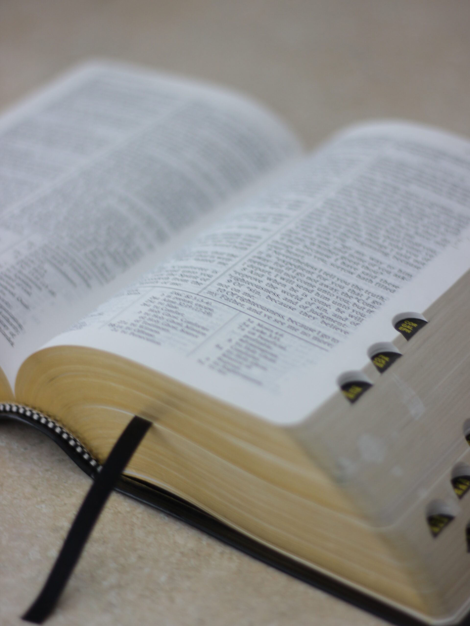
The image of the young man reading his scriptures on page two uses several important photography rules. One, shown here by the red lines, is the Rule of Thirds. This rule says that the most interesting parts of your photo, or the locations in the photo most likely to draw a viewers eye are along or at intersections of these lines. The photographer here did a great job of placing the young man’s head in the upper right crosshair of the grid and has outlined the scriptures quite nicely with the bottom left section of the grid.

The photographer also implemented Depth of Field. This means that part of your image is in focus, and part is blurry or out of focus. Using Depth of Field draws the viewers eye right to the crisp focus of your image, which in this case is the young man’s face. The blur in this image is so strong that even parts of his sleeves that are too far or too close to the camera appear fuzzy.
Think we can copy it? Let’s give it a try. I’ll post three unedited images here that could be a viable replacement for the image above.
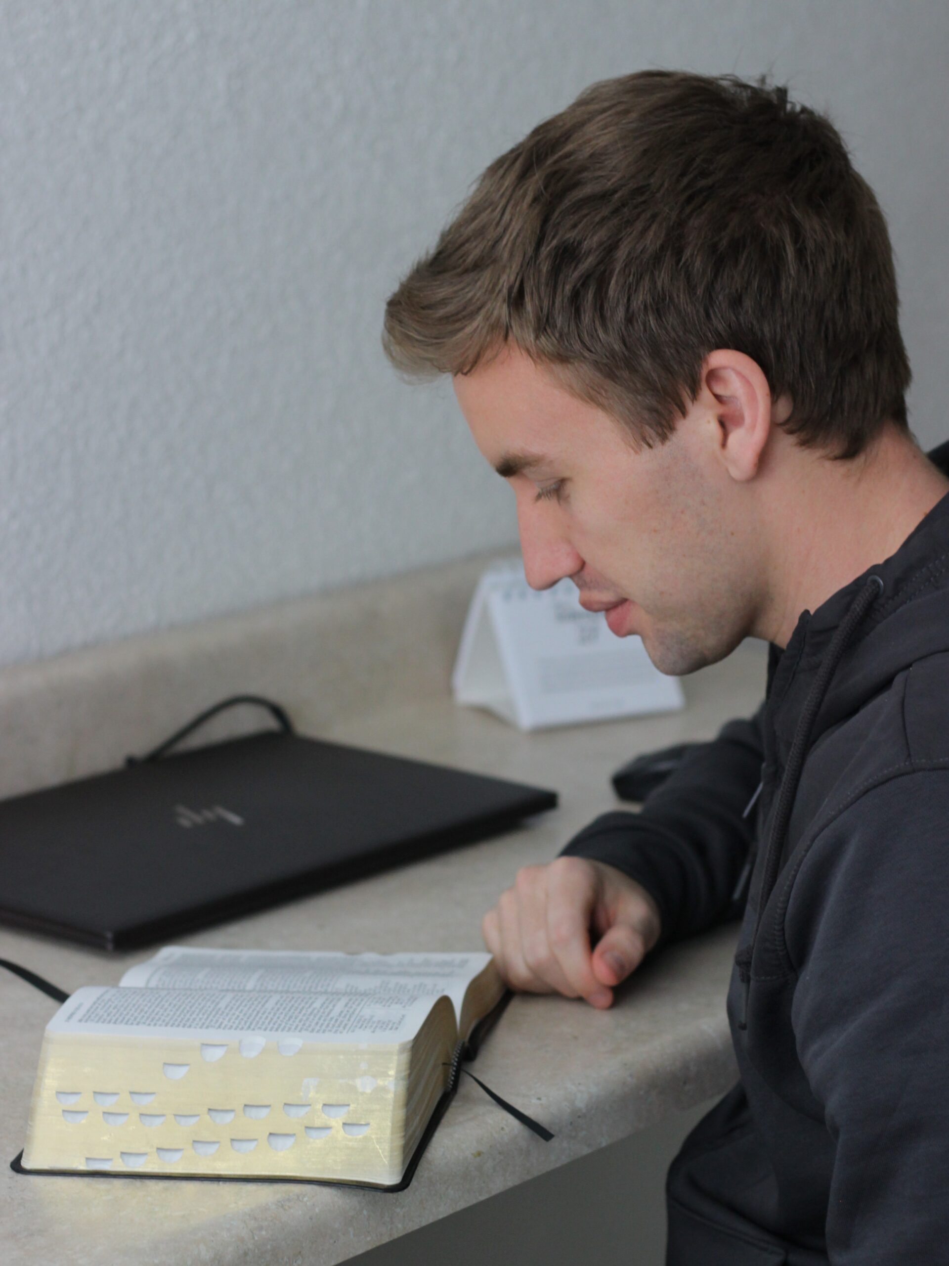
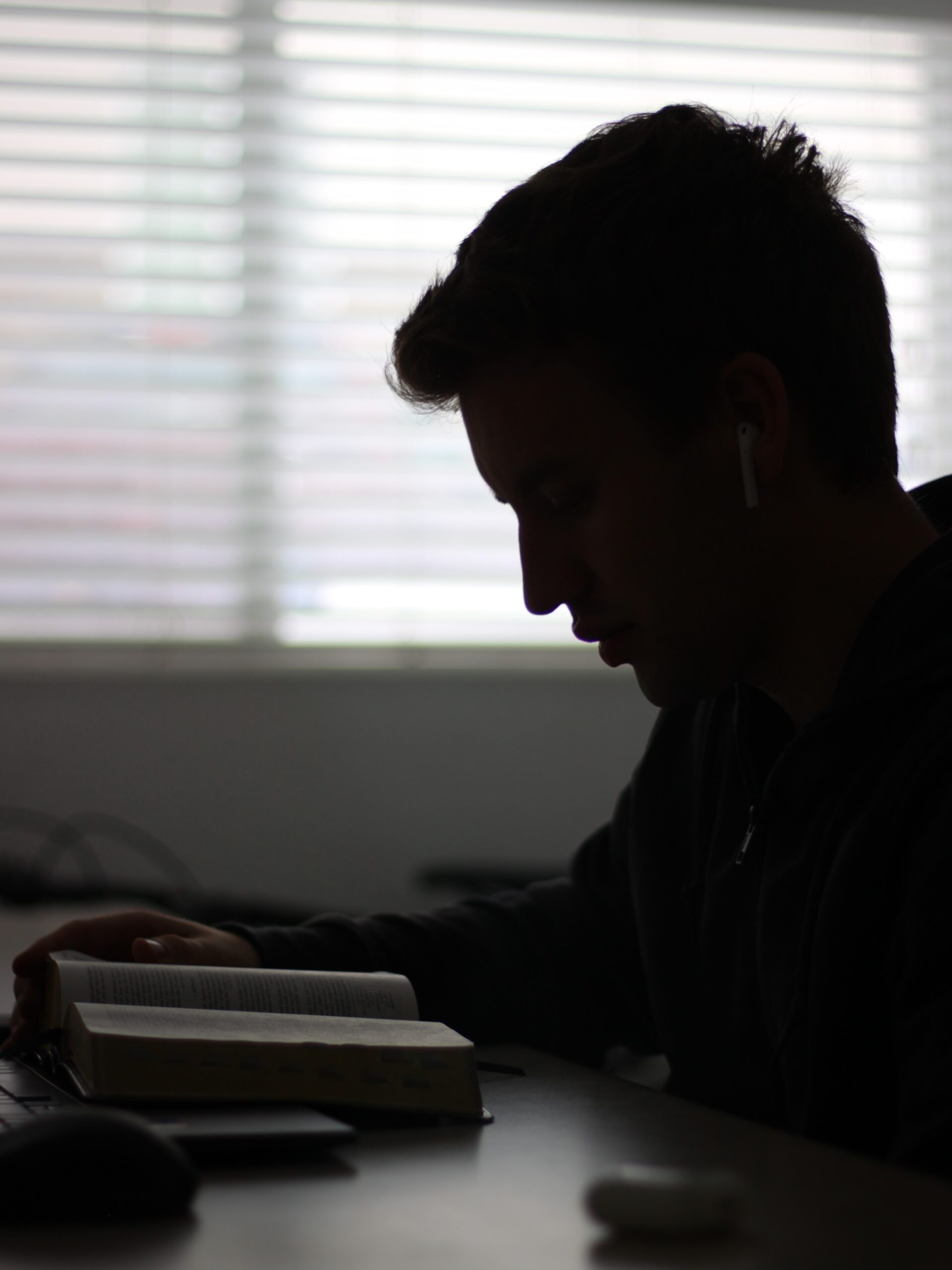
All three photos make use of the Rule of Thirds technique used in the magazine photo, with the young man’s head lining up with the top right crosshairs or the corner of the scriptures in the lower right crosshairs. All three photos also use the Depth of Field principle to highlight the focus subject, and all three match as good alternative photos to go with the question in the magazine—”How can I know that I hear the Lord’s voice in my life?”.
Summary
All-in-all, I think we learned quite a bit from this example. The magazine spread clearly demonstrates effective use of multiple fonts of different types, allowing for pleasing contrast and easy organization of the pages. The use of different typography principles (like size, form, weight, structure, and color) helps the reader to identify similar elements throughout the spread and know what is most important. The pictures contribute to the polished final result and reflect a solid understanding of good photography rules, like the Rule of Thirds and Depth of Field.
Well, now that you know all this what are you waiting for? Get out there and make some great content!